
There’s been a lot of discussion lately about the ethics of photo manipulation. Tom Till, the noted Southwest photographer, brought this up recently in a piece he wrote for Outdoor Photographer magazine. He found that he had drifted along the seductive path of saturation: if something looks good with bright colors, just make the colors brighter. After comments from several friends, he resolved to tone down some of his images. Even more recently a photographer won a prestigious international photo contest, only to have the honor stripped from him because of over-manipulation. He claimed he didn’t read the rules closely enough.
A few years ago I stepped inside a photo gallery in the prestigious little artsy town of Carmel, once home to such greats as Ansel Adams and Edward Weston. Even today, the town teems with some of the great photographers in the country. In this case, as I stepped into the busy gallery, the colors of the giant enlargements virtually screamed over-saturation. The colors were practically migraine-causing. For this photographer, however, the technique worked and he was making a lot of money.
 The over-manipulation road is an easy one. Learn a few basic Photoshop (or Elements) tricks and you’re on your way. I’ve seen it happen over and over with my students. Many of them become enamored of HDR (high dynamic range), another potential photo villain. At this point it’s time for some careful diplomatic conversation with these students, and I urge restraint. But am I right?
Who’s to say? I’ve said before on this blog that one must follow one’s heart, and this doesn’t always correspond with the reality of what the scene really was. In the midst of a red rock sunset in southern Utah, the colors can be truly overwhelming. Is it right or wrong to saturate, to express what your heart feels here? I’ve darkened stormy skies to accentuate the weather, “popped up” the colors of fall leaves and committed other processing sins.
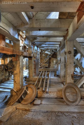
The attached photo is an example. It was taken in the gold stamp mill in the ghost town of Bodie. I’ve done this image (and many variations thereof, as I’ve been here often over the years with my photo workshops) as a black and white. This version, however, “speaks” to me. I applied mild HDR processing and presto, the beautiful colors of the wood resonated. The reality of the actual scene is a near-monochrome. Bodie is a town of incredible wood textures, and these stout timbers are a good example of that.
I think manipulation should be restrained, unless it’s blatantly departing from reality, and then it becomes art or whatever you want to call it. The viewer instantly knows that you’ve done a lot of manipulation.